Case study
M5 Module
Infographic Redesign
A full redesign of a complex LLM learning infographic for Johns Hopkins University Carey Business School — improving typography, visual depth, and information flow for slide-based delivery.
JHU Carey
Learning Design
2024
Illustrator
Data Visual
⇆ Drag
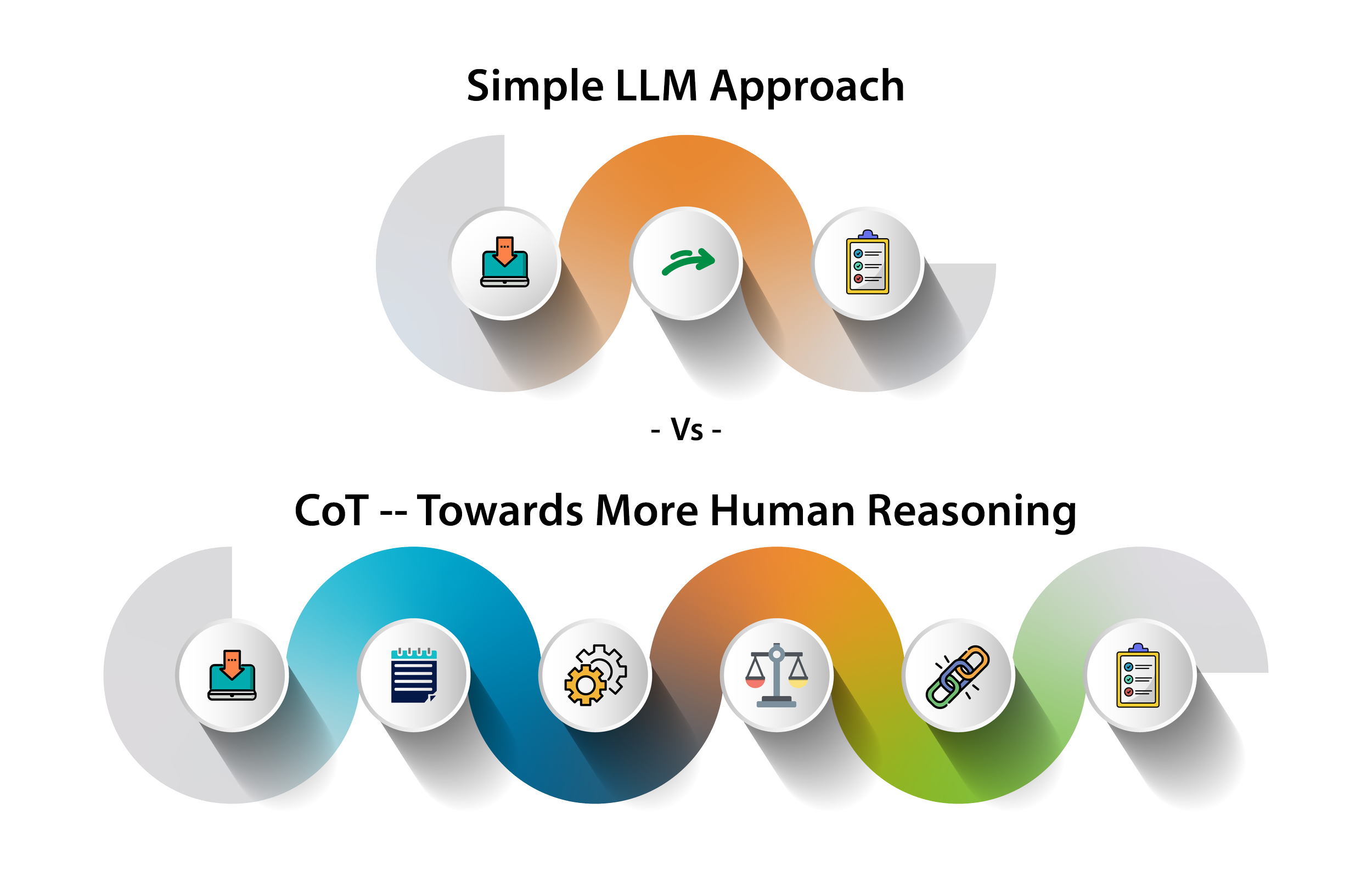
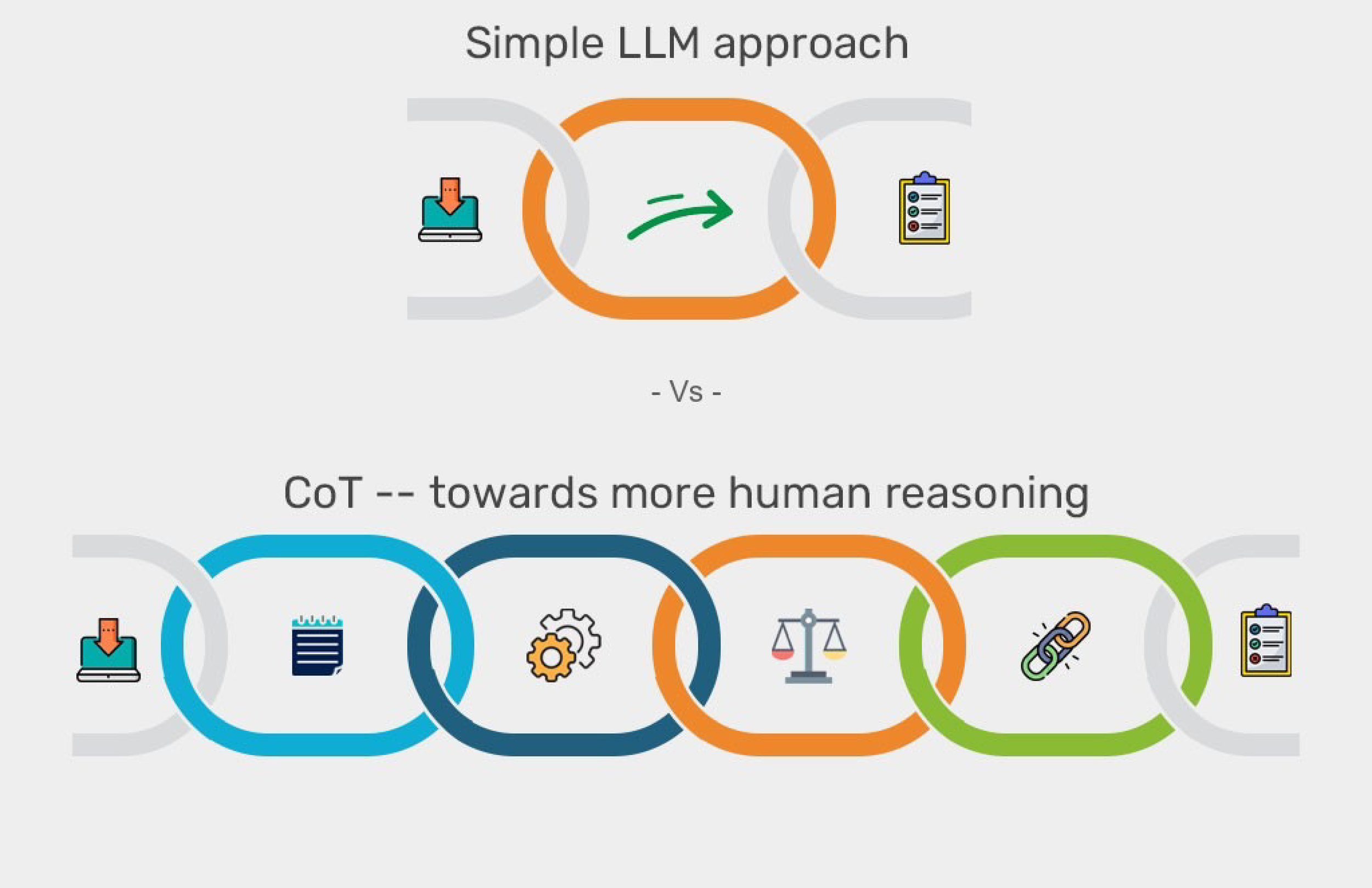
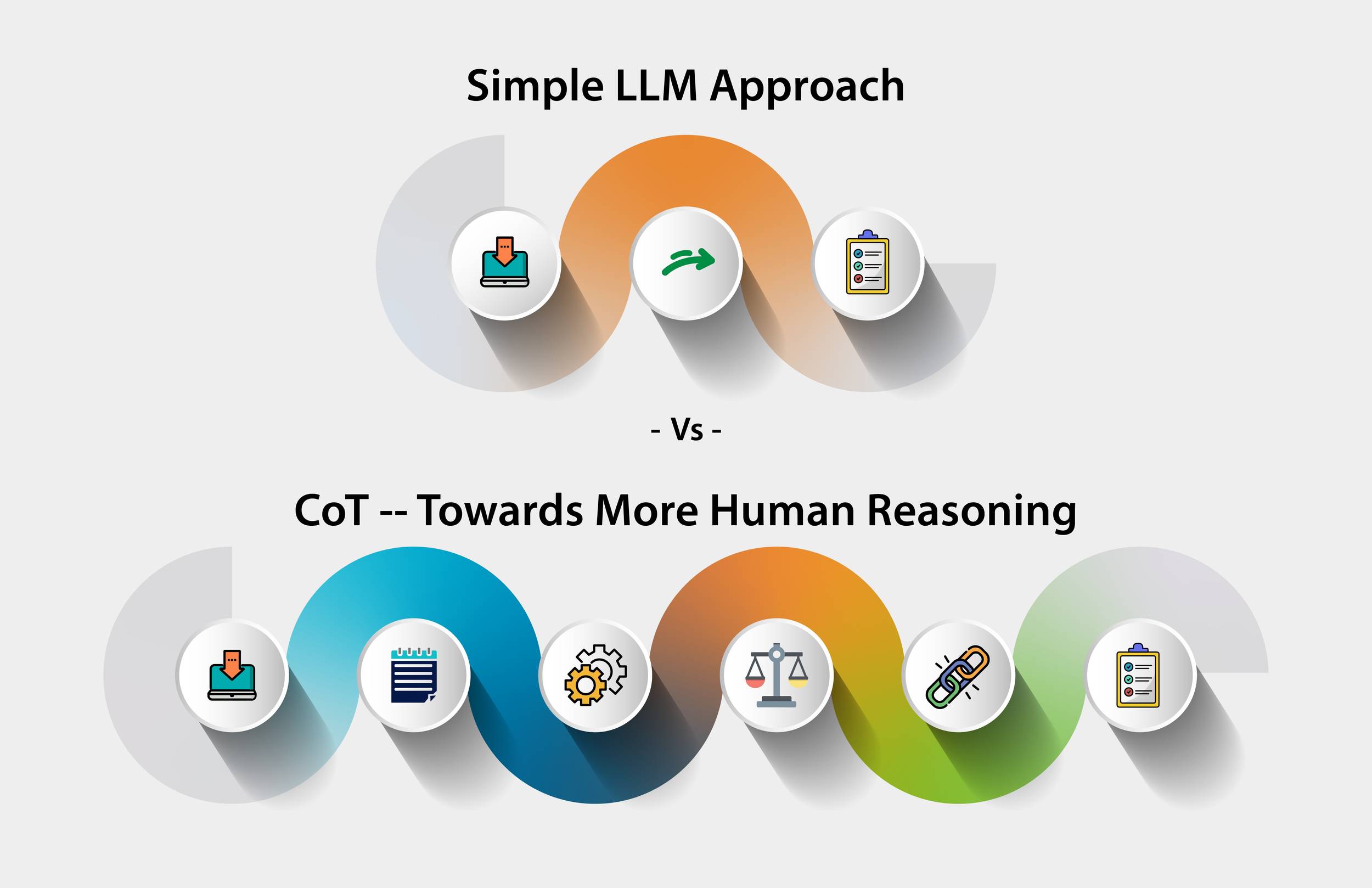
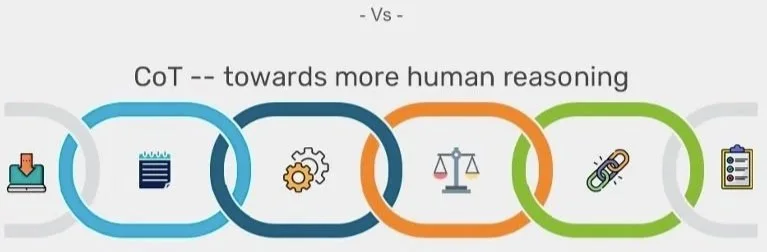
Design breakdown
What changed — and why it matters.
01
Typography & Hierarchy
Readability
Spacing
Casing
Before

After

02
Neumorphic Depth & Component Polish
Vectors
Shadows
Icons
Before

After

03
Color System & Visual Flow
Gradient
Color mapping
Modular
Before
After

Problem
What wasn't working
Dense, hard-to-read layout with no visual hierarchy
Rasterized components looked blurry at slide size
No color logic — phases were visually indistinct
Solution
What I redesigned
Rebuilt typography system with clear heading hierarchy
Vectorized all components with neumorphic depth treatment
Applied gradient color ribbon to guide visual flow
Impact
What changed
Slides now readable at full screen without zooming in
Components scale crisply to any resolution
Students parse phases faster with color-coded flow
My role
Information architecture
Typography system
Visual hierarchy
Color system design
Component vectorization
Slide-ready formatting
Tools
Adobe Illustrator
Google Slides
Final deliverable